Windows Type kicks OSX Type's ASS: Part II
My friend Derek and I were talking about my original post on how Windows type kicks OSX type's ass, and he told me that he had done quite a bit of research on the issue. He thought he was crazy, but soon found out he wasn't.
In my previous post on the topic, I was really criticizing a rendering anomaly. The effect I showed happened when an underlying window was exposed:

However, this post will describe some of the research Derek did with some commentary from yours truly. First, consider this blog post made way back in 2003:
http://www.macobserver.com/columns/devilsadvocate/2003/20030523.shtml
If you click on the second image in that post, you can clearly see how the Windows type is simply superior to the Mac version. Keep in mind that screenshots of displays can be misleading. If sub-pixel smoothing is employed, the image capture will have sub-pixel artifacts which when displayed on an LCD with a different RGB geometry, will produce crappy-looking text. However, I can attest that what yoy probably see when viewing those screenshots is my experience.
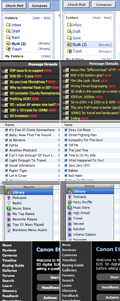
Consider this sample created by Derek. OSX on the left, Windows on the right:

You tell me which is better? Before you do that, some caveats:
-
the web sites depicted may point to fonts not available on both platforms (unlikely)
-
LCD geometry issues could make the screenshots invalid (unlikely)
Mac OS X type is just “blurry” when compared to Windows type.
This is kind of disturbing when you consider that OS X prides itself on the superior rendering quality of quartz. Perhaps Microsoft has a patent on ClearType (their sub-pixel antialiasing technology) and Apple refuses to license it.
Here is a Mac vs Windows type showdown. There, the Mac wins mainly for the number of fonts provided, not necessarily on the quality of type on the platform.
As a recent “switcher”, I really hope the quality improves somehow. While I can see myself “getting used to” the reduced clarity, I still hope for the best.