« October 2005 | Main | December 2005 »
November 28, 2005

November 27, 2005
Bryce
I rediscovered a program I had used quite heavily back in the day. And the old addiction set in as I dug into it again. I’m talking about a program called Bryce. The current version is 5.5, but I was one of the old-timers using version 2 through 4 of the program when Kai Krause of MetaCreations was still making it… you know, of Kai’s Power Tools fame. I don’t even know who makes it now, but I can get the latest version for $99. I’ll have to think about that…
I don’t think I mentioned Bryce in my previous post because I had forgotten how powerful it is for synthetic scenes. I got it stuck in my head that it could only render beautiful tropical islands. Over the weekend, I relearned what I used to know and somehow pushed way beyond that. The whole thing just made sense to me now where it was kind of a mystery to me before.
Here is a gallery of the stuff I did over the weekend. It’s all cheese, but it was a lot of fun. As a bonus, my kids loved it! My oldest must have clocked 5–6 hours on it at least. Some of his scenes are at the end. Click on any of these to see a larger version.

(my sons and I had loads of fun with this one and the next one. They did all of the cool space sound-effects…)


Here are some of the ones my kids did:


November 23, 2005
Alive in Joburg
 I saw this excellent amateur production last night called “Alive in Joburg”. I was referred via Drawn! The Illustration Blog.
The file is kind of large (79.1MB) and it downloads rather slowly, er, very slowly. I recommend you alt-click in FireFox and download it locally instead of playing it in-place.
You’ll need QuickTime but I’m not sure what codec it uses and thus which version of QuickTime you’ll need.
The movie is a really good satire on Apartheid.
UPDATE: The file is now on archive.org:
http://www.archive.org/details/ALIVE_IN_JOBURG
November 22, 2005
Funny google anomaly
1. Go to www.google.com
2. Type in "french military victories", without the quotes
3. Instead of hitting "Search" hit "I'm feeling Lucky"
I saw this posted on my Astronomy club mailing list.
2. Type in "french military victories", without the quotes
3. Instead of hitting "Search" hit "I'm feeling Lucky"
I saw this posted on my Astronomy club mailing list.
The Number Spiral
 This is more of a test of a blog post from a digg.com article than it is anything else, but some of these patterns are cool! I'll have to edit this blog entry to get the image in there...
read more | digg story
More on glass buttons
 I decided to waste some more time tonight so I found an old friend of mine on the Internet, the Perspective of Vision Raytracer, and got to work on creating a glass button.
I was curious about which object and lighting properties produced the kinds of effects I was reproducing artificially in the lab.
What I found was that it was very difficult to get the effects I was looking for, even after I seemed to understand how the POV-Ray script language worked. What you see to the left is what I’ll call the best image that I produced. Every aspect of that image is deliberate and it took me hours to figure out how to create it.
 Even so, it still appears slightly fake but I had to stop the madness before it consumed me further. Notice that the side view to the right shows the true shape of the object. It’s kind of a flattened sphere. Actually, that’s exactly what it is.
The Jade enclosure is an object created by Constructive Solid Geometry and it’s basically another squished sphere but half of it is eaten by a box via the difference statement.
difference {
    sphere {
        <0,0,0> 2.5
        texture { Jade} // color and clearness
        scale <0.9,1,0.4>
    }
    box {
        <-3,-3,0>,  // Near lower left corner
        <3,3,-3>   // Far upper right corner
        pigment {color White transmit 1} // color and clearness
    }
}
The actual “jewel” is simply a red sphere that transmits 60% light, has an index of refraction of 1.4 and has 30% reflectivity. There are a few other properties such as specular lighting which give it that nice highlight that you see. Some of the other properties are even more subtle. Here is he jewel markup:
sphere {
    <0,0,0> 2
    pigment {color Red transmit 0.6} // color and clearness
    finish {
        diffuse 0.9
        ambient 0.0
        specular 0.4
        reflection {
            .3
        }
    }
    interior {
        ior 1.4 // refractive with light interaction
        fade_distance 5 fade_power 1
    }
    scale <0.9,1,0.4>
}
 Now, let’s say I wanted to try and reproduce the Adobe Illustrator glass button I created in my previous post.
After a while, I realize that the effect of the Illustrator button seems to imply that there are two light sources. I couldn’t seem to get even close any other way.
In addition, the solid white border is very difficult to achieve. If the butt is indeed glass, then the white gets colored by the green light coming out of the jewel. That looks a bit strange as you can see here.

In the end, it’s almost 2am and this is as close as I got. It looks more like a green metallic ball than it does a glass ball. I suppose I have a lot to learn about raytracing.
If you would like to render these images yourself and possibly tweak them, these are the files that you need: demo.pov and demo2.pov. Just download the raytracer from the download page and load up these files.
Cheers!
November 21, 2005
Reminder: Frappr
This is a reminder, in case you meant to add yourself to the Primordial Ooze Bog Frappr Map but forgot to. Please ignore this is you simply don’t want to add yourself.
I really need to put a permanent link to this on my sidebar. Part of my ongoing, but slow-going, blog usability effort…
Happy 2nd Anniversary Primordial Ooze
This moment in time represents the 2nd anniversary of the Primordial Ooze blog. I originally wrote this entry on Thursday, November 17 2005 but I used the "Scheduled" post feature of Movable Type which allows me to specify the exact time that the post is to appear on the site. So long as the 'schedule tasks' cron job is running on the underlying Linux server that is home to the Primordial Ooze blog, you should get this on November 21, 2005. The time of the post should be identical to my first blog post, 12:05:21am. I must have been up late when I installed the software for the first time.
In 2003, I started this blog because I loved the concept of an online diary and memoir. I remember I was sitting at Bertucci's in October 2003 with my friend Rob and we were talking about .NET. He was telling me about all of these bloggers at Microsoft and the cool stuff they were talking about. I started to get really interested and before long I started this blog. I never looked back.
In my head, a blog was a perfect means for me to publish my ideas, my work, and my craziness. If I were to send the contents of these posts to my friends, they would quickly change their e-mail addresses. E-mail is just not the appropriate vehicle for some of the things I want to write. A blog is perfect for me to say just about whatever I'm thinking and go into whatever level of detail I can stand about some random topic.
For those of you who subscribed back in the early days, thanks for sticking around. For those of you who are new, I hope you stay on as long as this crazy train stays on the rails.
Cheers,
Nick
November 20, 2005
Journeymaps
You’ll have to categorize this post as uber-geeky. If you can’t handle an extreme level of geekiness, I suggest you cut out now.
So, this post concerns my D&D campaign, which isn’t running yet but for which I’m now preparing for a possible January ‘06 start time. Over the past few weeks and months, I’ve been working with the players to create the origins of their characters. Like any good novel, I see the development of the characters in the story as a key element to an engaging story. A significant part of a character’s makeup is their origin. This defines how they were raised, what traumas they endured, and can explain a lot about their behavior as the story unfolds.
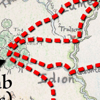
Writing the origins has been easy for some, but more challenging for others. One of the complaints that my characters have been bringing up is their inability to visualize where they have been in the world I’ve created. In addition, there are some major current events (like large-scale natural and unnatural disasters) that they need to incorporate in their narrative. To help with this, I spent a few hours tonight creating something I’ll call for now a Journeymap. A Journeymap is a map of my world overlayed with a red path which maps the places a character has been from birth to the present. Here is a sample journeymap:

I have a few more uploaded to these wiki pages:
http://www.primordia.com/cgi-bin/moin.cgi/Timeon
http://www.primordia.com/cgi-bin/moin.cgi/NicolinaAmakiir
http://www.primordia.com/cgi-bin/moin.cgi/AlluraBritelace
Creating the Journeymaps
I thought I’d spend a moment discussing how I created these Journeymaps and how I’ll maintain them. All of the maps are generated from a single Adobe Illustrator file. The file has this layer structure:
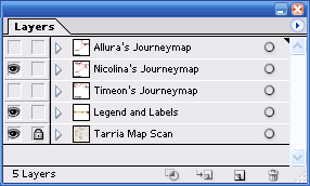
The base layer called “Tarria Map Scan” is the scan of my worldmap. My source scan is enormous, 14 in. by 16 in at 300dpi. I didn’t need that much pixel data in this layer so I rez’d down to about a quarter those pixels (8 in by 8in at 300dpi). This gives me clear image data when I generate a 1024 pixel wide final image which is what I felt was a good size.
I also made the map layer 50% transparent which mixes with the white background so the lifepath and text would clearly show over the hand-drawn map.
The next layer is the “Legends and Labels” layer. This is what you see at the bottom.
The next layers contain all of the lifepath information for each character. When I generate a Journeymap for the website, I only reveal one of these layers during the “Save for Web…” process.
This method affords me a few advantages:
- I save disk space over having a separate Illustrator file for each Journeymap.
- I can optimize the appearance of the scan (say adjust the translucency) or update the legend once and not have to repeat these adjustments in each file.
There are a few other subtletes in the map, which I’ll point out. The red paths have a slight drop-shadow to help increase contrast.
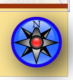
I also did my best to incorporate the glass button into the map. This is just a work in progress, but you can see the result below. The actual compass rose is kind of lame and is merely a placeholder. I hope to get some time to make a very nice looking map compass rose overlayed on that nice blue jewel ;-)
November 19, 2005
Microscope Shots
I have a bunch of pictures on my hard drive, shots taken with our USB microscope that I've been meaning to post.
You can find the first batch here:
http://www.flickr.com/photos/nickcody/sets/1401910/
I'll try and get the rest of the snapshots together and post them as I can.

You can find the first batch here:
http://www.flickr.com/photos/nickcody/sets/1401910/
I'll try and get the rest of the snapshots together and post them as I can.
November 17, 2005
Frappr Map for Primordial Ooze
Yes, we’re a small community but we’re strong and proud. Ahem. Please join me and add yourself to the Primordial Ooze Frappr Map.
Frappr is a service which exploits the Google Map API to produce a geographic map of blog readership complete with pictures and shout outs. It’s completely based on voluntary subscription. You can add as little or as much information about yourself. I would be thrilled if you would consider adding yourself to the map.
Cheers.
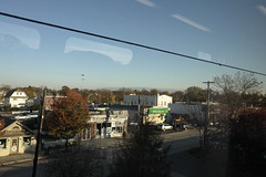
Bellmore in the morning
I snapped this off this morning while on the train to work. I was in one of the newer trains, so the glass is new and free of grime. I wonder how long that will last?
Easy Glass Buttons
For a long time now, I’ve been wanting to figure out how to make a glass button. There is a lot of material out there but most of it describes ways to create glass buttons in Adobe Photoshop. Instead, I wanted to create a glass button in Adobe Illustrator so I would have a resolution independent solution.
Tonight I went looking again and I came across a link to a Photoshop action file that would create one of these bad boys. I decided to try the action and see if I couldn’t reverse-engineer the button.
As luck would have it, the action created a nice layer file for me to play around with. The green button you see to the left is actually missing two steps that add a final polish to the Photoshop button. The green button to the right was generated by the Photoshop action. It has a nice bottom and top “halo” blur that I had trouble reproducing in Illustrator.
I think at first glance they both look good. Upon further inspection I must admit that the AMR Photoshop action button looks better. I’m not going to try and fix that bottom and top halo in this post. Rather, I’ll just describe how I reversed engineered the action (as far as I did) and how I created the simpler button in Illustrator.
First, I inspected the layer file created by the button. It resembed the layers shown here:
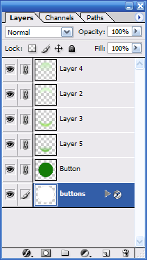
My task was basically to figure out what was happening in layers 5, 3, 2, and 4. I’m going to ignore the white outer disk since it’s just a white disk with a drop shadow effect applied to it. The other layers are more interesting. If I were to turn off all of the layers, I get a simple flat color disk as follows:

If I turn on Layer 5 (only), I see this:

Well, that’s easy!
It’s a circle with a vertical gradient fill using the screen compositing effect. The screen effect “screens” the background based on the color in the screening object. Usually you just use black and white where black does nothing and white screens shows up 100%. Since I don’t want the white to actually show as white, I adjust the transparency to 50%. This yields me an illustrator image that looks like so (click to enlarge):
What you can’t see is that the fading circle is just a circle, filled with a white to black gradient. There are a few other things to take note, too. First, I set “screen” as the compositing mode for the gradient object. Second, I adjusted the midpoint of the gradient toward the white end of the spectrum. This made the circle “disappear faster” as you go upwards.
The next layer in the Photoshop file I couldn’t figure out in Illustrator. It’s some kind of glow. This is what it looks like on its own:

The next layer, layer 2, is just like layer 3 so I’ll skip it.
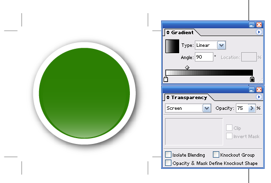
The next layer, layer 4, is basically the same as the first layer, layer 5, but it’s flipped upside-down and it’s “stronger” (has less transparency) and is a bit smaller. This is what it looks l ike by itself:

To implement this, I used these settings in Illustrator (click to enlarge):
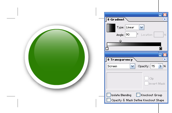
Notice the differences from the first layer. The opacity is 75% instead of 50%. Plus, the black/white gradient disc is smaller. In the end, we get a nice button that looks like the one in the upper-left corner of this blog, viola:

Now that I have this kind of button, and the knowledge on how to make it, I can jazz up all of my graphics with it. If you were interested in poking around with the Illustrator file, you can get it here.
Finally, the discussion really wouldn’t be complete without some resolution independent eye-candy!

In a future post, I’ll try and figure out that halo blue and I’ll create rectangular glass buttons since those have a completely different glass effect. Until then, enjoy!
November 16, 2005
Smart Wallpaper
So, I set one of those snazzy wallpapers that I mentioned in my last post and I thought to myself… I wonder if Vista and WPF in general will spur the development of what I’ll call “smart wallpaper”. This is a vector-based wallpaper that will look good no matter how big you stretch it. Obviously photographic non-vector backgrounds will be stretched and interpolated, but these can always be supplied at high resolution just like today. What would be interesting is either enhancing static images with vector logos and text or perhaps supply a complete wallpaper using vector graphic definitions.
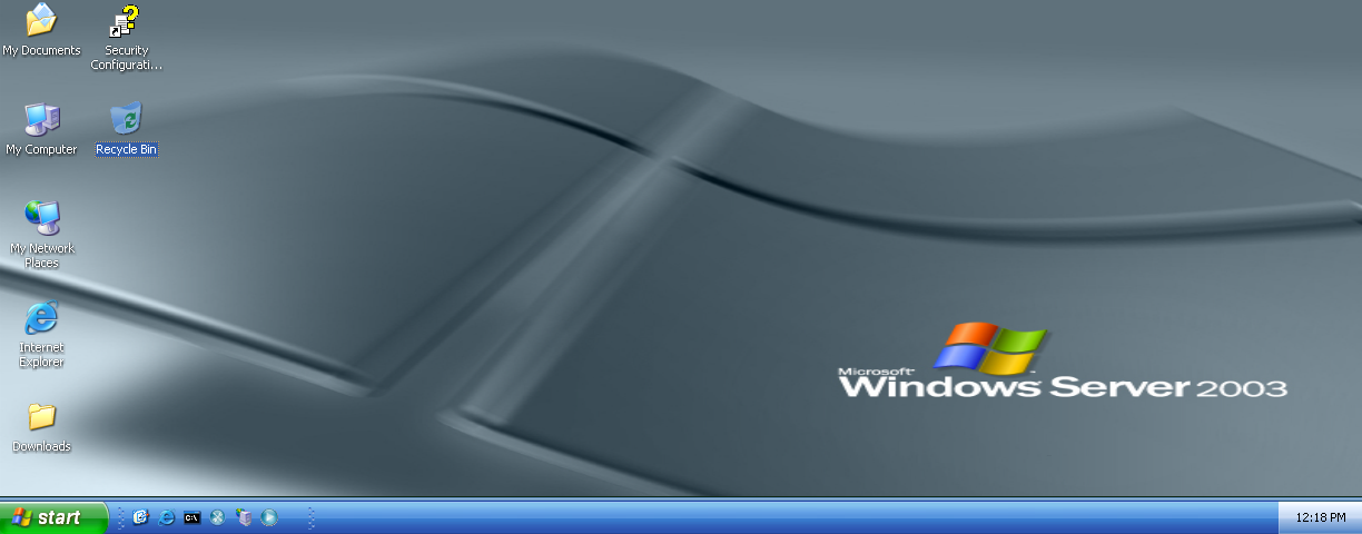
Check out this stretched Windows Server 2003 wallpaper. The image could easily be a vector graphic but even if it were a static image, the text could be rendered on the fly making this obvious stretching unnecessary.
High-resolution Macro Wallpapers
 Michael Swanson Microsoft blogger has created an impressive macro wallpaper gallery that you should definitely check out. There are dozens of amazing photographs at ideal sizes for your high-resolution standard or widescreen monitors.
It took me too long to do this, but I've finally created a single-page collection of my macro wallpaper images (with downloadable zip files). I've gone back to my source files and reformatted many of them for both widescreen (1920 x 1200) and standard (1600 x 1200) monitors. As I create new images, they'll be added to this collection page. For convenience, I've also added a link to the left side of this site titled Wallpaper Images.
November 15, 2005
Microsoft Anti-spyware to remove Sony Rootkit
I’m not that consistent with comments on current events in computing but this one tickled me a bit.
I just read a post over over at Dvorak Uncensored that links to a BBC News Article which t alks about how Microsoft has labeled Sony’s CD DRM Root-kit as spyware. Hooray for Microsoft. Or, maybe not.
Sony was unable to provide a means to safely remove the software themselves. Sony should be grateful to Micrsosoft for bailing them out like this. The situation could have gotten a lot worse! Perhaps Microsoft should have let the situation boil over a bit more before acting.
November 6, 2005
Stylesheet under construction
The stylesheet for the site is currently under construction. My Movable Type Templates were quite old once I upgraded to 3.2 and some of the pages were displaying very poorly as a result. I updated all of my templates but the new ones require updated stylesheets since the classes referenced in the new templates don’t exist in my old customized stylesheet.
So, I applied a random style created with Arvind Satyanarayan’s Movable Type Style Generator. Some of this still confuses me but I’ll work it out. It will just take some time.
November 3, 2005
AIM is EVIL
At least the public beta of their “Triton” line. At work and at home I installed it. The only reason why I use AIM is because a lot of people I know use it. I don’t know why, the client is pretty bad. The triton beta was much more modern so I had high hopes. Then something happened. At work a few days ago and just now (there, finished with the uninstall) a process called AOLHostManager.exe was sucking up almost 100% CPU (50% on my HT machine).
Good riddance.
So, I thought it time to check out Sysinternals.com’s Rootkit Revealer. This morning, I listened to Episode 12 of Security Now, a podcast by Steve Shields Up! Gibson and Leo Call for Help Laporte. They talk about how Sony installs a rootkit on your Windows box if you insert one of their enhanced CDs and say “Yes” when “Autoplay” kicks in. Can you believe that? Anyway, they turned me on to Rootkit Revealer.
I ran it and it didn’t show anything that worried me. The program seems to look for registry entries and files where a difference is found between what the Windows API returns and what some more primitive “raw” methods they employ return.
Video Feed, redux
I just watched Episode 20 of CommandN on the train and they talk about the del.icio.us trick that I talked about a few weeks ago. As they were talking about it, I was almost getting excited that they were going to mention me. Then I remembered that I only have 23 readers. Lifehacker, a very cool site, had very similar info on the topic. Of course, I made my post like a week before they did and some of the commenters to that post had figured this out in August or even earlier.
The one thing that still bothers me is that I can’t seem to figure out how to get multiple media types like movies & mp3 files together in the same feed. A friend of mine, Dan, went and posted an mp3 file to my del.icio.us tag but it didn’t come through my feed yet because the feed is using the “media” macro which del.icio.us defines as all “movie” files (like mov, avi, mpg, etc.). Maybe I’ll just set up an mp3 feed on the same tag.
I highly recommend CommandN. It’s fun to watch and they consistently point me towards very interesting sites.
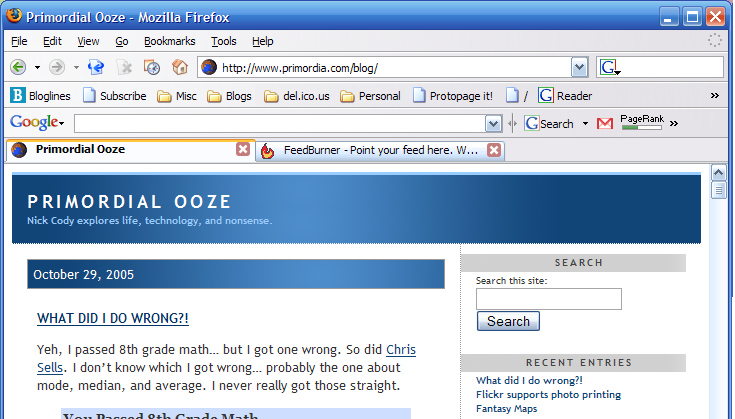
In particular, I learned about a FireFox extension called Tab X which puts a close X on each tab. This is much more convenient than right-clicking and closing the tabs that way. See here: